InConcert | Interaction Design
Assignment for "User Interface Design and Development" course, Fall 2013. Functional prototype here.
Teammates: Ryan Baker, Richard Chen, Charlie Hughes, Lisa Jervis
Challenge
The InConcert project started with a deceptively simple idea: to design a platform that makes it easier for people to attend live music with their friends. Based on our research, we determined InConcert’s core functionality—invitation functionality, a ticket-buying service, and a marketplace—and developed them iteratively. The result is a work in progress, design that has come a long way but that needs further refinement of its core and further development at its periphery.
Paper Prototype
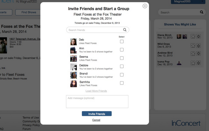
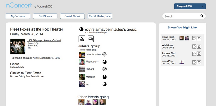
After our initial contextual inquiries, the first phase of the design process was to create lo-fi paper prototypes. As a team, we decided on the following four major tasks that our system would support: finding a show, organizing a group to go to a show, responding to a show invitation, and buying a ticket to a sold out show/selling an extra ticket.
Interactive Prototype
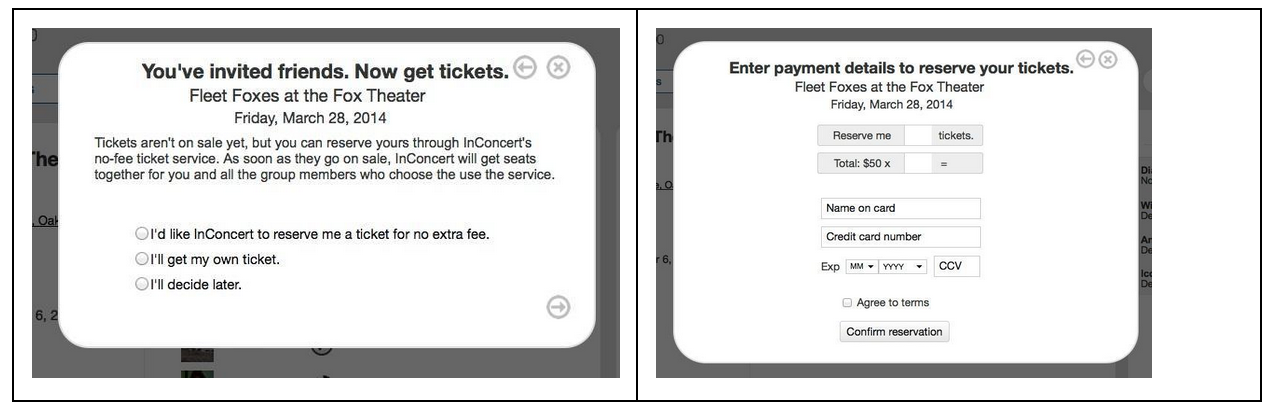
Based on feedback from formative evaluations on our paper prototypes, we built an interactive prototype in Balsamiq. One of our focuses was creating consistency across the site. Other challenges included grappling with the intense amount of complexity our paper prototypes had accommodated in the our workflows. For example, giving users a choice of reasons for RSVPing “maybe,” and offering them alerts when the composition of the group changed seemed fine on paper, and some testers of the paper prototype expressed enthusiasm for the idea. But when we translated the functionality to something more closely matching a real user interface, its clunkiness became unbearably clear. This is where we began to see how paring down our complexity as much as possible would serve us well. I designed the home page:
Functional prototype
In our final prototype, we had four tabs to focus on the basic interactions we wanted to support:
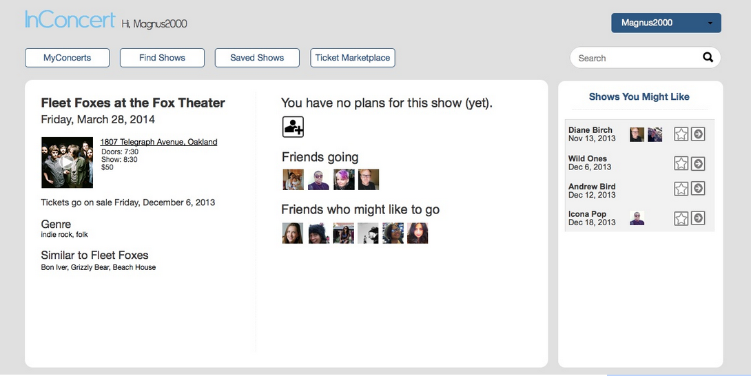
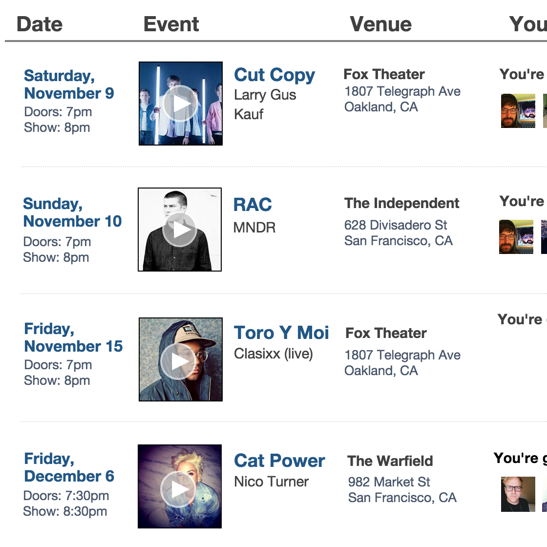
keeping track of shows the user is attending
learning about shows in the area, both for bands he links and those his friends are attending
saving shows to potentially attend
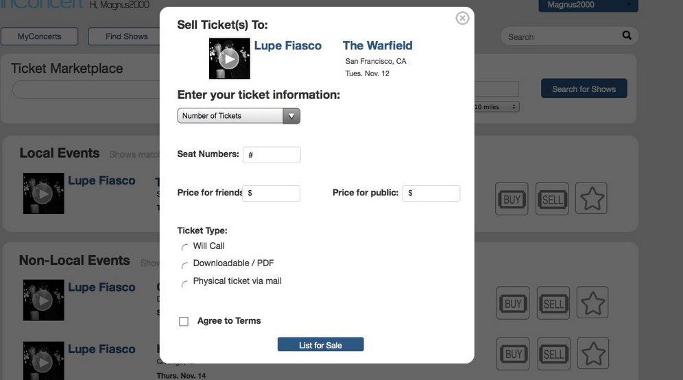
buying/selling extra tickets without having to go through scalpers
We aimed for consistency in our layout from page to page: a grid where the event information is displayed horizontally, and information such as the date, band name, and friends’ attendance status are aligned vertically. However, we made minor adjustments between pages to emphasize certain information components depending on the primary purpose of the page. For instance, the date is emphasized both with size, color, and by being on the left on the MyConcerts page, since the most important feature on that page is knowing which shows you’re attending when. I designed the grid pattern that we used as a temple on various pages of the site, and focused on the “MyConcerts” page.
Extras
Our final prototype is at http://bit.ly/1gxg8D9. Selected screenshots are below.